똑같은 삽질은 2번 하지 말자
vue-chartjs을 사용해 DoughnutChart를 만들어보자 본문
개요
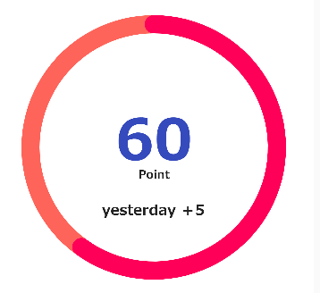
vue-chartjs 3 version을 사용해 이하의 이미지같은 도넛차트를 만들어보자
잘 정리된 일본 공식문서..? 한국어로 된건 없는거 같다.
最初に | 📈 vue-chartjs
最初に vue-chartjs は Chart.js をvueで使用するためのラッパーです。 再利用可能なチャートコンポーネントを簡単に作成できます。 初めに vue-chartjs あまり手間をかけずにvueの中でchart.jsを使うこ
vue-chartjs.org
우선 DoughnutChart든 LineChart든 기본적인 방법은 비슷한데 코드로 보면
<script>
import { Doughnut, mixins } from 'vue-chartjs'
const { reactiveProp } = mixins

export default {
  extends: Doughnut,
  mixins: [reactiveProp],
  props: ['options'],
  data() {},
  mounted() {
    this.renderChart(this.chartData, this.options)
  }
}
</script>
extends로 사용할 형식의 차트를 넣고
reactiveProp으로 chartData를 reactive하게 받아준다, (reactiveProp은 chartData밖에 없다. options는 따로 받아줘야한다.)
그리고 mounted 훅에 renderChart를 해주면 된다.
mixin의 reactiveProp
그럼 만들어보자.
부모.vue
 <doughnut-chart :chart-data="datacollection" :options="donghnutChartOptions"></doughnut-chart>

 // -------------------- //

 data() {
    return {
      donghnutChartOptions: {
        legend: { display: false }, // datasets의 labels를 선언함으로 생기는 legend를 비표시로
        cutoutPercentage: 85, // 차트의 굵기
        elements: {
          arc: {
            roundedCornersFor: 0
          },
          center: [
            {
              text: '60',
              font: 'bolder 4rem sans-serif',
              fillStyle: '#354abd'
            },
            {
              text: 'Point',
              font: 'bold 0.8rem sans-serif',
              fillStyle: '#222222'
            },
            {
              text: '昨日比+5',
              font: 'bold 1rem sans-serif',
              fillStyle: '#222222'
            }
          ]
        }
      }
    }
  },
  computed: {
    datacollection() {
      return {
        labels: ['score', ''],
        datasets: [
          {
            data: [60, 40],
            backgroundColor: ['#ff0058', '#ff645a']
          }
        ]
      }
    }
  },
기본적으로 chartData의 형태는 Object로 labels와 datasets를 가지고 있고 내부 요소들은 배열들로 되어있다.
각각 배열안의 요소들은 다른 배열요소와 index로써 연결되어 있다고 생각하면 편하다.
(예를 들면 labels의 첫번째 score는 data가 60이고 색깔이 #ff0058이다.)
options에 관해서는 너무 방대하므로 따로 문서를 찾아보는걸 추천한다.
https://github.com/chartjs/Chart.js/blob/master/docs/charts/doughnut.md#general
GitHub - chartjs/Chart.js: Simple HTML5 Charts using the <canvas> tag
Simple HTML5 Charts using the <canvas> tag. Contribute to chartjs/Chart.js development by creating an account on GitHub.
github.com
나는 이번에 roundedCorner와 centerText를 구현하기 위해 그에 해당되는 정보를 options에 넣어서 chart에 건네는 방법을 쓰고있다.
참고로 그 외에도 기존에 정의되어 있는 속성들도 아주 많다.
DoughnutChart.vue
<script>
import { Doughnut, mixins } from 'vue-chartjs'
const { reactiveProp } = mixins

export default {
  extends: Doughnut,
  mixins: [reactiveProp],
  props: ['options'],
  data() {
    return {
      value: 60
    }
  },
  mounted() {
    const drawCenterText = chart => { // 센터에 글자를 그리기 위해
      if (chart.config.options.elements.center !== undefined) {
        const { width, height, ctx } = chart.chart
        ctx.restore()
        chart.config.options.elements.center.forEach((item, index) => {
          ctx.font = item.font
          ctx.fillStyle = item.fillStyle
          ctx.textBaseline = 'middle'

          const textX = Math.round((width - ctx.measureText(item.text).width) / 2)
          const textY = height / 2

          ctx.fillText(item.text, textX, textY + index * 40 - 10)
        })
        ctx.save()
      }
    }
    const setInfoForRoundedCorner = chart => {
      if (chart.config.options.elements.arc.roundedCornersFor !== undefined) {
        var arc = chart.getDatasetMeta(0).data[chart.config.options.elements.arc.roundedCornersFor]
        arc.round = {
          x: (chart.chartArea.left + chart.chartArea.right) / 2,
          y: (chart.chartArea.top + chart.chartArea.bottom) / 2,
          radius: (chart.outerRadius + chart.innerRadius) / 2,
          thickness: (chart.outerRadius - chart.innerRadius) / 2 - 1,
          backgroundColor: arc._model.backgroundColor
        }
      }
    }
    const drawRoundedCorner = chart => { // 그래프의 가장자리가 둥그스럼하게 하기 위해
      if (chart.config.options.elements.arc.roundedCornersFor !== undefined) {
        var ctx = chart.chart.ctx
        var arc = chart.getDatasetMeta(0).data[chart.config.options.elements.arc.roundedCornersFor]
        var startAngle = Math.PI / 2 - arc._view.startAngle
        var endAngle = Math.PI / 2 - arc._view.endAngle

        ctx.save()
        ctx.translate(arc.round.x, arc.round.y)
        console.log(arc.round.startAngle)
        ctx.fillStyle = arc.round.backgroundColor
        ctx.beginPath()
        ctx.arc(
          arc.round.radius * Math.sin(startAngle),
          arc.round.radius * Math.cos(startAngle),
          arc.round.thickness,
          0,
          2 * Math.PI
        )
        ctx.arc(
          arc.round.radius * Math.sin(endAngle),
          arc.round.radius * Math.cos(endAngle),
          arc.round.thickness,
          0,
          2 * Math.PI
        )
        ctx.closePath()
        ctx.fill()
        ctx.restore()
      }
    }
    this.addPlugin({
      id: 'centerText',
      afterDraw: drawCenterText
    })
    this.addPlugin({
      id: 'roundedCornerGraph',
      afterUpdate: setInfoForRoundedCorner,
      afterDraw: drawRoundedCorner
    })
    this.renderChart(this.chartData, this.options)
    this.htmlLegend = this.generateLegend()
  }
}
</script>
plugin을 이용해 중앙텍스트와 그래프의 가장자리를 둥그스럼하게 하는걸 구현했다.
이렇게 플러그인을 본인이 개발해도 되는데 이미 오픈소스로 이런 플러그인도 있는걸로 알고있다.
(밑의 참고한 문서의 2번째 문서에 들어가보면 나와있음)
참고한 문서
Chart.js Doughnut with rounded edges and text centered
I am trying to achieve rounded corners similar to this article here, but combined with text in the centre, so far i have the code below, but i am not sure how to combine both ideas Any help woul...
stackoverflow.com
[Vue.js] 16. use doughnut chart with label plugin
vue-chartjs를 사용하다 보면, 여러가지 custom하고 싶은 욕구가 생기기 마련입니다. 물론 다른 여러가지 chart를 그려주는 library를 사용할때도 마찬가지 입니다. 오늘은 vue-chartjs 중 doughnut chart를 구현
ayoteralab.tistory.com